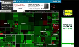
The map is a powerful new tool for spotting investment trends and opportunities. This quick-start guide will show you how to interpret the map, drill down for detailed information and customize your view. The map lets you watch more than 500 stocks at once, with data updated every 15 minutes. Each colored rectangle in the map represents an individual company. The rectangle's size reflects the company's market cap and the color shows price performance. (Green means the stock price is up; red means it's down. Dark colors are neutral). Move the mouse over a company rectangle and a little panel will pop up with more information. This has been added to Financial Sources Subject Tracer™ Information Blog. This has been added to Business Intelligence Resources Subject Tracer™ Information Blog.
posted by Marcus Zillman |
4:57 AM